Redesigning for Conversion
My first task at Anghami was to redesign the landing page, www.anghami.com, in one month. The redesign had to take into consideration the huge unforeseen increase in popularity of the Anghami app. Visitors were coming from all sorts of devices and with a language preference of either english or arabic. I was the UX designer and front-end developer of this project, and I worked with the developers, founders, and a graphic designer to get on track quickly and find the most critical elements of the new website.
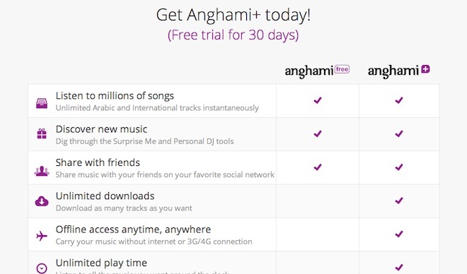
A main addition to the landing page was the introduction of the paid version of Anghami, which means that the user action we're looking for is not just download the app but also pay for it. We are selling a service, so we want to give an impeccable experience on both, mobile and desktop.
The first challenge was designing the message we want to communicate. Our audience is still new to using smartphones, and is not used to paying for mobile services. This is not to mention that our audience is used to downloading free, pirated music. Our users are not familiar with terms like streaming, Spotify, or music subscription. I listened to the team members to get acquainted with how our users think, spent time on Anghami's Facebook page to get to know the users more, and looked at Google Analytics to see how they behave.
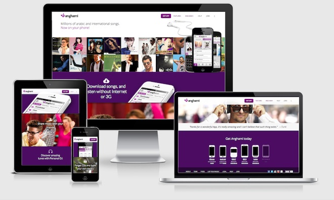
Any decision we made had to take into consideration desktop and mobile, english and arabic. This brings us to the second challenge, which is about technical development. I was also the front-end developer of the landing page, and had to create a responsive design that is not just readable on mobile, but rather pleasant. Also, the site had to be available in english and arabic, where english goes from left to right, and arabic in the opposite direction. What this implies is that the code had to be very well structured. After all, a left margin of 2em in the english version is a margin to the right in the arabic version. With that in mind, I tried to take advantage of the direction flow that HTML and CSS provide rather than fight it with specific language selectors. The website was mainly developed using Middleman App, HTML5, CSS3, and JQuery.
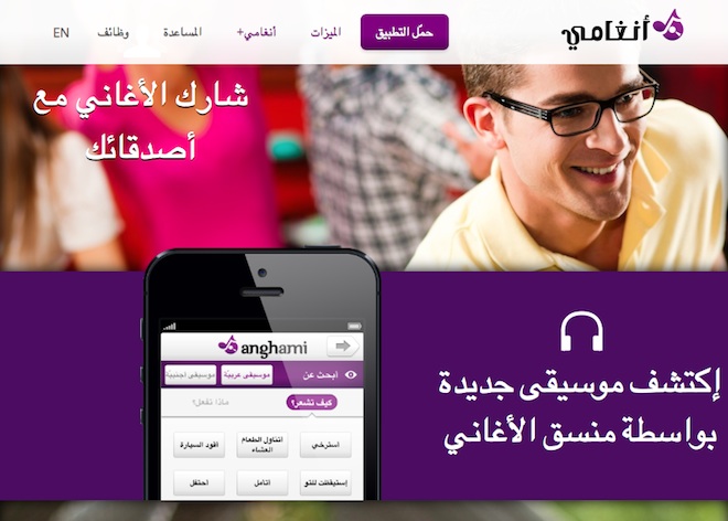
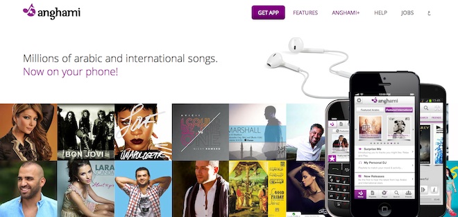
The final landing page design starts with album arts that expose our huge library of arabic and international songs, followed by the features that our app offers. Although the app has unique features, we opted to display simpler ones to get users acquainted. Afterwards, we compare the free and plus versions of the app, and encourage the user to download the app. We then reconnect with the user through other touchpoints to introduce our plus version: push notifications, email, and Facebook notifications.
The release of the new website showed significant increase in time spent on the page and a much lower bounce rate. What's impressive is that mobile users are spending more time on the page than desktop users. The team at Anghami has a work-in-progress spirit, where we release often, analyze, and iterate, so we are always looking at feedback and optimizing the site. Take a look at the site yourself!